Why You Should Use Tailwind for Your Next Web Project
The Problem
When building a new website or web app, it can be tempting to use any old CSS framework in your project and focus on the content. Yes, it looks great, but it also looks exactly like the 99 million other websites that also use the same framework. So to make it “stand out,” you add a few style overrides, and then some more, and then a few more. Now your site looks somewhat unique, but you also have written more CSS than HTML.
Don’t get me wrong — every CSS framework has its benefits and strengths. For a novice user, maybe it’s easier to get the styling out of the way by using a pre-designed component-oriented framework. But what this article covers is the next step.
Complex styles, conflicting with each other, components overriding the global stylesheet, 3 different oranges on a page — things can get messy very quickly when you advance to more custom UIs.
And that’s where a utility-driven framework like Tailwind CSS can help.
We will answer three main questions in this article:
- What does utility-driven mean?
- How neat and clean are component classes in typical frameworks?
- How easy is customizing CSS frameworks?
Utility-driven? Scary
First of all, no it’s not scary. Let me explain.
Most CSS frameworks and templates give you a TON of components to work with. Each component is designed in a particular way and you MUST use the component in that way. If you decide to change things up, the hundred or so styles that hold the component together will fall apart.
With Tailwind, there are no components. You explicitly design the page using Tailwind’s low-level utility classes instead of having to copy-paste a component with arbitrary classes and a meaningless hierarchy of div elements.
Here’s an example of a card using Bootstrap, a very popular CSS framework:
<div class="card">

  <div class="card-body">

    <h5 class="card-title">Card title</h5>

    <p class="card-text">Lorem ipsum dolor sit amet consectetur adipisicing elit. Eligendi, eos!</p>

    <a href="#" class="btn btn-primary">Go somewhere</a>

  </div>

</div>
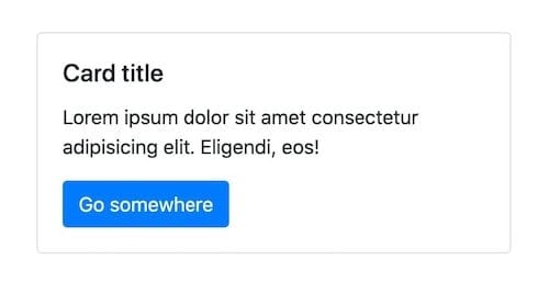
And here is the same component I recreated from scratch using Tailwind:
<div class="border text-gray-900 rounded p-2">

  <div class="p-2">

    <div class="font-medium text-xl mb-2">Card title</div>

    <p class="mb-4">Lorem ipsum dolor sit amet consectetur adipisicing elit. Eligendi, eos!</p>

    <a href="#" class="rounded p-2 text-white bg-blue-600">Go somewhere</a>

  </div>

</div>
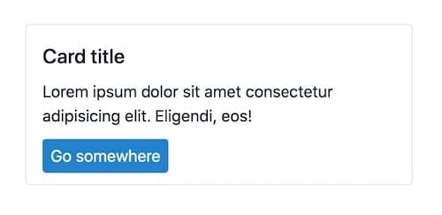
Comparing the two, you can tell I had to write a bit more of Tailwind’s utility classes in the HTML compared to Bootstrap. It might seem a waste of time to write out so many classes for font size, spacing, and color, all explicitly. “The leading framework gives me more for a lot less!” I hear you saying.
Yes, you are not wrong. Being utility-driven means you need to write every style explicitly for it to be applied. Component-driven frameworks, meanwhile, let you write just a few predetermined classes and give you a whole component in return.
But that’s also just half of the story. There are still two more questions we need to address.
Extra baggage
In typical frameworks, what exactly are classes like card, card-body, and card-text doing in the background?
Let’s take a look behind the scenes of both of our sample projects above. I have taken the complete CSS source files from both Bootstrap and Tailwind (from here and here), and ran them through PurgeCSS to strip out any unused CSS. This leaves us with only the CSS that is used to style the HTML we have written.
Let’s look at Bootstrap first — all 230 lines of it:
/*!

 - Bootstrap v4.5.2 (https://getbootstrap.com/)

 - Copyright 2011-2020 The Bootstrap Authors

 - Copyright 2011-2020 Twitter, Inc.

 - Licensed under MIT (https://github.com/twbs/bootstrap/blob/main/LICENSE)

 */

:root {

  --blue: #007bff;

  --indigo: #6610f2;

  --purple: #6f42c1;

  --pink: #e83e8c;

  --red: #dc3545;

  --orange: #fd7e14;

  --yellow: #ffc107;

  --green: #28a745;

  --teal: #20c997;

  --cyan: #17a2b8;

  --white: #fff;

  --gray: #6c757d;

  --gray-dark: #343a40;

  --primary: #007bff;

  --secondary: #6c757d;

  --success: #28a745;

  --info: #17a2b8;

  --warning: #ffc107;

  --danger: #dc3545;

  --light: #f8f9fa;

  --dark: #343a40;

  --breakpoint-xs: 0;

  --breakpoint-sm: 576px;

  --breakpoint-md: 768px;

  --breakpoint-lg: 992px;

  --breakpoint-xl: 1200px;

  --font-family-sans-serif: -apple-system, BlinkMacSystemFont, "Segoe UI", Roboto, "Helvetica Neue", Arial, "Noto Sans", sans-serif, "Apple Color Emoji", "Segoe UI Emoji", "Segoe UI Symbol", "Noto Color Emoji";

  --font-family-monospace: SFMono-Regular, Menlo, Monaco, Consolas, "Liberation Mono", "Courier New", monospace;

}

*,

*::before,

*::after {

  box-sizing: border-box;

}

html {

  font-family: sans-serif;

  line-height: 1.15;

  -webkit-text-size-adjust: 100%;

  -webkit-tap-highlight-color: rgba(0, 0, 0, 0);

}

body {

  margin: 0;

  font-family: -apple-system, BlinkMacSystemFont, "Segoe UI", Roboto, "Helvetica Neue", Arial, "Noto Sans", sans-serif, "Apple Color Emoji", "Segoe UI Emoji", "Segoe UI Symbol", "Noto Color Emoji";

  font-size: 1rem;

  font-weight: 400;

  line-height: 1.5;

  color: #212529;

  text-align: left;

  background-color: #fff;

}

 h5 {

  margin-top: 0;

  margin-bottom: 0.5rem;

}

p {

  margin-top: 0;

  margin-bottom: 1rem;

}

a {

  color: #007bff;

  text-decoration: none;

  background-color: transparent;

}

a:hover {

  color: #0056b3;

  text-decoration: underline;

}

a:not([href]):not([class]) {

  color: inherit;

  text-decoration: none;

}

a:not([href]):not([class]):hover {

  color: inherit;

  text-decoration: none;

}

 h5, .h5 {

  margin-bottom: 0.5rem;

  font-weight: 500;

  line-height: 1.2;

}

h5, .h5 {

  font-size: 1.25rem;

}

.btn {

  display: inline-block;

  font-weight: 400;

  color: #212529;

  text-align: center;

  vertical-align: middle;

  -webkit-user-select: none;

  -moz-user-select: none;

  -ms-user-select: none;

  user-select: none;

  background-color: transparent;

  border: 1px solid transparent;

  padding: 0.375rem 0.75rem;

  font-size: 1rem;

  line-height: 1.5;

  border-radius: 0.25rem;

  transition: color 0.15s ease-in-out, background-color 0.15s ease-in-out, border-color 0.15s ease-in-out, box-shadow 0.15s ease-in-out;

}

@media (prefers-reduced-motion: reduce) {

  .btn {

    transition: none;

  }

}

.btn:hover {

  color: #212529;

  text-decoration: none;

}

.btn:focus {

  outline: 0;

  box-shadow: 0 0 0 0.2rem rgba(0, 123, 255, 0.25);

}

 .btn:disabled {

  opacity: 0.65;

}

.btn:not(:disabled):not(.disabled) {

  cursor: pointer;

}

.btn-primary {

  color: #fff;

  background-color: #007bff;

  border-color: #007bff;

}

.btn-primary:hover {

  color: #fff;

  background-color: #0069d9;

  border-color: #0062cc;

}

.btn-primary:focus {

  color: #fff;

  background-color: #0069d9;

  border-color: #0062cc;

  box-shadow: 0 0 0 0.2rem rgba(38, 143, 255, 0.5);

}

 .btn-primary:disabled {

  color: #fff;

  background-color: #007bff;

  border-color: #007bff;

}

.btn-primary:not(:disabled):not(.disabled):active {

  color: #fff;

  background-color: #0062cc;

  border-color: #005cbf;

}

.btn-primary:not(:disabled):not(.disabled):active:focus {

  box-shadow: 0 0 0 0.2rem rgba(38, 143, 255, 0.5);

}

.card {

  position: relative;

  display: -ms-flexbox;

  display: flex;

  -ms-flex-direction: column;

  flex-direction: column;

  min-width: 0;

  word-wrap: break-word;

  background-color: #fff;

  background-clip: border-box;

  border: 1px solid rgba(0, 0, 0, 0.125);

  border-radius: 0.25rem;

}

.card-body {

  -ms-flex: 1 1 auto;

  flex: 1 1 auto;

  min-height: 1px;

  padding: 1.25rem;

}

.card-title {

  margin-bottom: 0.75rem;

}

.card-text:last-child {

  margin-bottom: 0;

}

@media print {

  *,

  *::before,

  *::after {

    text-shadow: none !important;

    box-shadow: none !important;

  }

  a:not(.btn) {

    text-decoration: underline;

  }

  p {

    orphans: 3;

    widows: 3;

  }

  @page {

    size: a3;

  }

  body {

    min-width: 992px !important;

  }

}
We can see how much CSS is used to format the seemingly simple-looking card. You can see there are quite a few classes present that don’t match any class we wrote in the HTML. Easy for us while coding, but costly in the browser.
Let’s look at Tailwind next:
/*! normalize.css v8.0.1 | MIT License | github.com/necolas/normalize.css */

html {

  line-height: 1.15;

  -webkit-text-size-adjust: 100%

}

body {

  margin: 0

}

a {

  background-color: transparent

}

 p {

  margin: 0

}

html {

  font-family: system-ui, -apple-system, BlinkMacSystemFont, "Segoe UI", Roboto, "Helvetica Neue", Arial, "Noto Sans", sans-serif, "Apple Color Emoji", "Segoe UI Emoji", "Segoe UI Symbol", "Noto Color Emoji";

  line-height: 1.5

}

*, ::after, ::before {

  box-sizing: border-box;

  border-width: 0;

  border-style: solid;

  border-color: #e2e8f0

}

a {

  color: inherit;

  text-decoration: inherit

}

.bg-blue-600 {

  --bg-opacity: 1;

  background-color: #3182ce;

  background-color: rgba(49, 130, 206, var(--bg-opacity))

}

.rounded {

  border-radius: .25rem

}

.border {

  border-width: 1px

}

.font-medium {

  font-weight: 500

}

.text-xl {

  font-size: 1.25rem

}

.mb-2 {

  margin-bottom: .5rem

}

.mb-4 {

  margin-bottom: 1rem

}

.p-2 {

  padding: .5rem

}

.text-white {

  --text-opacity: 1;

  color: #fff;

  color: rgba(255, 255, 255, var(--text-opacity))

}
Just 81 lines. Clean, simple, and neat. You can see that the only classes present in the CSS are the ones we have mentioned in the code, and nothing else. This is the magic of Tailwind’s utility-driven framework. What you see (in the HTML) is what you get (in the CSS).
Looking at the sizes of both of these purged CSS files, the difference is clear:
Bootstrap
Lines of CSS: 230
Purged CSS: 5kb
Tailwind
Lines of CSS: 81
Purged CSS: 1kb
Custom design
The best frameworks are the ones that get out of the way and let you build what you want. Tailwind has an advantage here as well. Let’s take a look at an example, using the card we made earlier. We want to create a card with no border, more rounded corners, a light red background, and a shadow that darkens on hover.
In Bootstrap, we can use utilities to remove the border and add the base shadow, but we will need to write some custom CSS for the background color, extra-rounded corners, and the darker shadow on hover. We would probably do something like the following:
<style>

  .card {

    background-color: #f5b3af;

    border-radius: 0.5rem;

    transition: 0.5s;

  }

  .card:hover {

    box-shadow: 0 1rem 3rem rgba(0, 0, 0, 0.25) !important;

  }

</style>

<div class="card border-0 shadow">

  <div class="card-body">

    <h5 class="card-title">Card title</h5>

    <p class="card-text">Lorem ipsum dolor sit amet consectetur adipisicing elit. Eligendi, eos!</p>

    <a href="#" class="btn btn-primary">Go somewhere</a>

  </div>

</div>
As you can see, we have started adding custom CSS already, despite using a CSS framework. This can get extremely cluttered and confusing by the time you are finished designing a full webpage or app.
Let’s take a look at Tailwind. We can use the multitude of utilities provided to make all of our customizations. We have many more color options built right into Tailwind, so picking just the right shade is easy. Tailwind even includes support for variants, such as hover. This means we can write hover: followed by any utility class, for example, to activate that style only on hover.
<div class="rounded-lg shadow-xl hover:shadow-2xl p-2 bg-red-200">

  <div class="p-2">

    <div class="font-medium text-xl mb-2">Card title</div>

    <p class="mb-4">Lorem ipsum dolor sit amet consectetur adipisicing elit. Eligendi, eos!</p>

    <a href="#" class="rounded p-2 text-white bg-blue-600">Go somewhere</a>

  </div>

</div>
Look — no CSS!
And you can definitely create a whole app without needing to write a single line of custom CSS.
Unique, versatile, maintainable
Tailwind has various configuration options, presets, and hundreds of utilities that will help get the job done without having to spend any time organizing your CSS or thinking of the best naming convention for your classes.
To learn more about Tailwind, hop on over to their wonderful website with endless documentation and detailed video tutorials.
No spam, no sharing to third party. Only you and me.


